5 UI/UX Tips For MEDITECH’s New Web-Based EHR
For those not following the rumors, the conjecture…and well, the words coming out of MEDITECH’s employees’ mouths at their CIO Forum; MEDITECH is developing a web-based EHR for 6.1. It will supposedly come in a tablet-friendly format (meaning web-browser based, but “designed” for a smaller screen), and no it does not appear that it is being developed by their recently acquired LSS Data Systems.
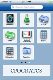
While I do certainly feel this is a move forward for MEDITECH, I do have some concerns, since the world behind the web browser is a bit of uncharted territory for them. Perhaps the apps will come much later, since that is the current trend, but in the meantime, here are 5 UI/UX tips, fairly broad in scope, that would be good for them to keep in mind since they are just starting down this path.
1. Design for the smallest form-factor first
A common mistake that multi-form-factor developers make is that they design first on how the application will work on a desktop computer. One should keep in mind though that in the world of the virtual canvas, it is much easier to expand than compress. Designing for the smallest form-factor forces you to prioritize the data being displayed and input to a severe extent. What is it about this patient that is critical for a physician to see upon first viewing? Physicians always want a comprehensive view to start out with (Vitals, Meds, Allergies, Lab Results, etc.) and then they’ll drill down if they want. To find out which data elements of these categories are the most important, survey physicians, nurses, receptionists and have them rank the data elements for you.
With each step up in form-factor, you reveal more and more of the prioritized items for the first look. If it is found that you don’t have enough real estate to display the “critical items”, that’s when you get creative. For instance, if not all of the vitals can be displayed on the screen of a smart phone, it may be best to just display those that are abnormal. Most of the diagnostic process is about filtering out the normal and finding what is abnormal. Sighs of relief will ensue when you begin design on the next form-factor because now there is more real estate, but maintain the mindset of being a minimalist. Having a larger canvas doesn’t mean making it more complicated, it just means you have to…
2. Keep it simple
Have you ever watched a user actually use an EHR? Their eyes dart madly all over the screen searching for what they are looking for. This doesn’t seem to change as they get more proficient at using the system either. The problem is that there are too many options. Flexibility is great and all, but you are already bombarding the user with information, why bombard them with choices too? Now at this point, I must clear up a myth: that every practice is different. That’s simply not true. Deliver the system with the one way to do things and then let the user customize little things here and there. Pretend you don’t have an entire project team employed by the client that is going to “build” this product. How “Out Of The Box” can you make it?
3. Treat the user with respect
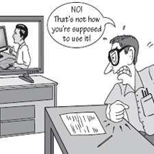
The above screen shot is actually taken from the MEDITECH website in the Customer section when clicking on which module’s tasks you want to look at. Instead of giving the user feedback (see my next point) after a single click that what they want is being done, the option of insulting the user into submission was pursued. There are plenty of examples like this in the existing EHR. The mindset of the designer should be to make it easy for the user to do the correct thing (i.e. the thing they want to do). Then always assume that the user is a smart, intelligent human being that is trying to do the right thing. This also means treating them like a person that’s trying to get through their job during the day. That means no giving them error codes that they won’t understand, calling them “users” to their faces, or insulting them by being snarky.
4. Give feedback…always
If ever the user has to ask: “what’s going on right now?”, your interface has failed. The user should always be oriented to where they are at in the system, what they are waiting for, and where they can go. If a button is clicked, the user should immediately know that it worked. If something is loading, give the user an estimate on how much time they will be waiting, not just a circling icon or a cycling load bar. If they want to go somewhere in the system, show them the best way to get there.
5. Test, Test, Test, Test, Test…
In addition to thoroughly testing your code, you should also thoroughly test your interface. Not just the standard unit testing (click here, did it break?), but with feedback from people who will actually have to use the system as to what worked for them and what didn’t. Does what the user expect to happen actually happen? A somewhat little known fact in the EHR world is that usability testing is actually a thing. You can hire companies to do it for you and there are certainly books on the subject as well.
So go forth! Explore the land of the web! Just remember, that there are a lot of people out there that know how to do this sort of thing and users are already conditioned to have high expectations of their experience utilizing the browser.
Comments
2 Responses to “5 UI/UX Tips For MEDITECH’s New Web-Based EHR”Trackbacks
Check out what others are saying...-
[…] (which can’t handle a browser’s back button) and spent many years on their own website (which insults me when I click a button twice). Meditech is not quick to adapt to anything. They still don’t recognize Apple products […]


Hi Aaron,
I just saw your post defining health informatics on HISTalk Practice.
What Meditech could do that is consistent with your 5 UI/UX tips for improving the interface design of their web-based EHR for version 6.1 and would really differentiate it from its EHR competitors is to standardize and clinically integrate the antiquated processes now being used to report the results of cumulative diagnostic tests. Accomplishing this would pride cost, quality and patient safety benefits by facilitating the viewing and sharing of this abundant and disorganized clinical data by physicians and patients for the first time.
You can see a description and illustration of this disruptive technology innovation at: http//diagnosticinformationsystem.com .
Best regards,
Bob Coli, MD