Revisiting the Analysis of Diagnoses in Populations

Awhile back (Forever, in internet terms) I wrote a post about how an analysis of the co-occurrence of diagnoses in a patient population. While it looked pretty cool, I had always been leery as to the statistical significance that the particular type of analysis I ran (Multidimensional scaling) had for some of the less frequent co-occurrences of diagnoses. That is to say: how often does one diagnosis that was put on a patient’s chart occur with another diagnosis on the same chart. In the end, the visualization was helpful to identify the most frequent diagnoses and show a general impact of how many other diagnoses would be put onto a patient’s chart with them, but it also produced a lot of clutter and wasn’t very clear in visually distinguishing between weak relationships and no relationships.
A few weeks ago, I re-visited the data set I had plus an additional one another client let me acquire after seeing what an open source network visualization program called Gephi could do. If you’ve ever seen a visualization of the relationships between the characters of Les Miserable, you’ve probably seen a Gephi created visualization. Additionally, I was able to figure out how to do a Market Basket Analysis utilizing R over the past few weeks as well which is a much more statistically relevant analysis. Market Basket Analysis is commonly used, as you may have guessed, by stores to try and figure out which items people frequently buy together. The why behind the items bought together is a totally different question; which you may remember Target creepily figuring out the answers to.
With these two new tools, I was able to analyze two different patient populations and determine which diagnoses frequently occur on the same patient together with statistical significance and also visualize those relationships in a clear manner. As a bonus, Gephi contains some analytical tools which can discover any clusters within the network. It has a host of other tools too, but the clustering provided a nice surprise which you’ll see below.
I think this analysis is a unique way to show not only the medical problems a patient population is being treated for, but also how those problems are being documented. It would be interesting to acquire more data sets to determine whether these could be unique “fingerprints” of a patient population being served or if they could be categorized into common patterns. Additionally, if I had data over time, I could animate these to show the change occurring in the network. This may be effective for visualizing the changing health concerns of a patient population.
Visualization Details:
The Market Basket Analysis (MBA) extracted only the statistically significant relationships between the co-occurrences, which is why not all of the diagnoses of the population are listed. You will notice a few unconnected diagnoses though. Once the relationships were established, I added in any diagnoses that occurred more frequently than the least frequent diagnosis of the MBA in order to show a little perspective. Therefore, the strength of a relationship is shown by the thickness of a line connecting two items. No line = no relationship. The size of the diagnosis bubble is relative to how frequent that diagnosis occurs in the population. Finally, the colors show the clustering patterns that were found. The unattached diagnoses all have different “clusters” because they aren’t related to anything so not much should be drawn from that. However, it was surprising to note that in the second population, the clustering separated out the brain-related disorders on its own. Perhaps with more more information the clustering would naturally isolate diseases that have similar biological causes. Models like this could aid public health programs or at least make for some good pictures for a TED Talk.
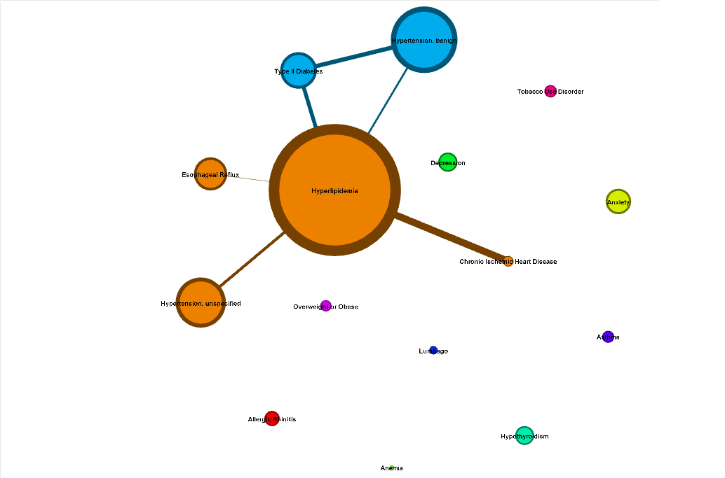
Patient population #1. Note how Chronic Heart Disease has a strong co-occurrence rate with Hyperlipidemia, but actually occurs less frequently overall than a number of different diagnoses.
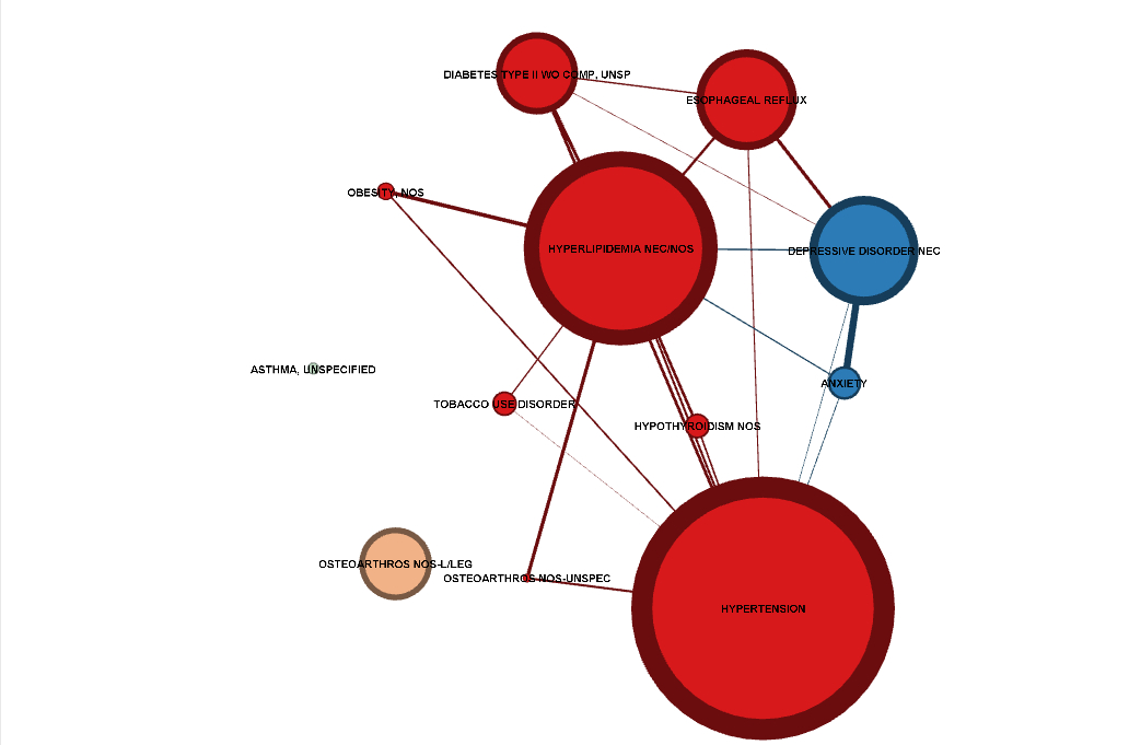
Patient population #2. Note how Depression and Anxiety, the only brain-related disorders listed, naturally cluster together in the cluster analysis
